Campaign Manager
Situation:
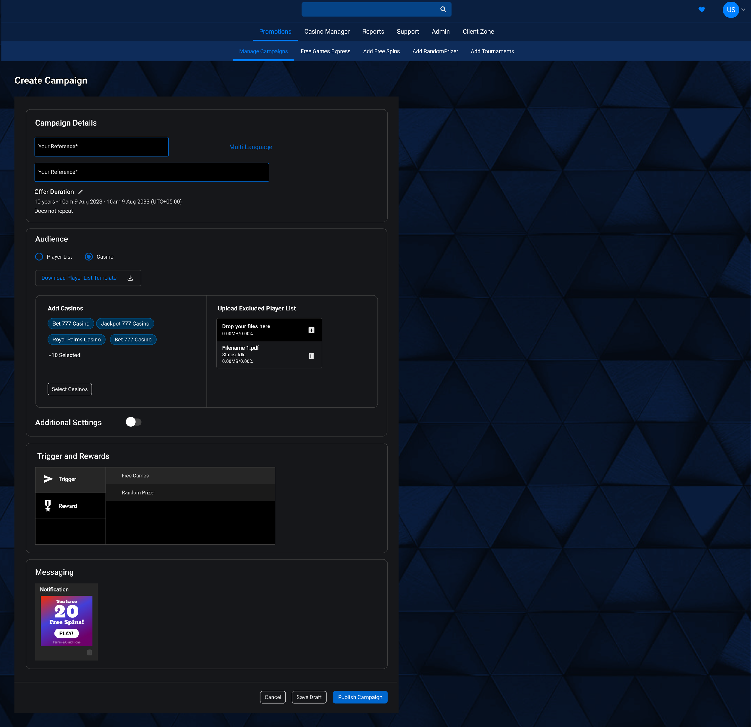
As a lead UX specialist I worked on optimising campaign creation flows. This required looking at 5 different apps and streamlining it into one single application to perform a campaign creation flow. The usability goal strived for easy of use due to a feature rich set up.
Task:
My job here was to create the screen designs for the set up while keeping ease of use in mind.
Activity:
I referred to my contextual inquiry documents enlisting the pain points of users. As part of my job I conduct routine user studies for each app in the product suite. This requires me to schedule end-users time and sit with them for 1 hour where walk me through their routine operations while talking about the good and bad aspects of the application. These sessions are recorded and documented for future use during an application re-design.
The information architecture was created in collaboration with the stakeholders where we decided the placement of various features under a larger category. The 5 different applications formed a major category in the new application and we now as a flow that contained campaign details, player selection, scheduling, campaign setup and messaging.
I decided to use the wizard approach with each of the categories as a step in the wizard. This allowed user to focus on one functionality at a time without being overwhelmed by complexity and the number of features. Next I took each step and prioritised the features on that page as frequent and infrequent. This allowed me to hide the infrequent features into an advanced section to be brought on demand.
As an alternate way of thinking, I decided to design for mobile first. This forced me to reduce the amount of information on the screen and to keep things simple. Once the mobile screens were approved we took it back to desktop.
This app also needed scalability where multiple promo types would be introduced to the users. We needed a homepage where user is introduced to each of these promo types and where he can learn and decided which ones to use. I created multiple options of navigating to these promo types from a homepage, main navigation, and settings area.
While designing I catered to all the user pain points from my documents and made sure to incorporate them to enhance ease of use.
As an option I created a one-page alternative to the stepper and tested it with users.
Various design options were explored for the promotion set-up step in the wizard. These included multiple design patterns such as accordion, workflow diagrams, panelled navigation, tabs, etc. This allowed the user to have a Birds Eye view of the setup this far while adding newer config.
Result:
The user testing with traditional users gave 8/10 on the wizard designs and is currently in the making.


